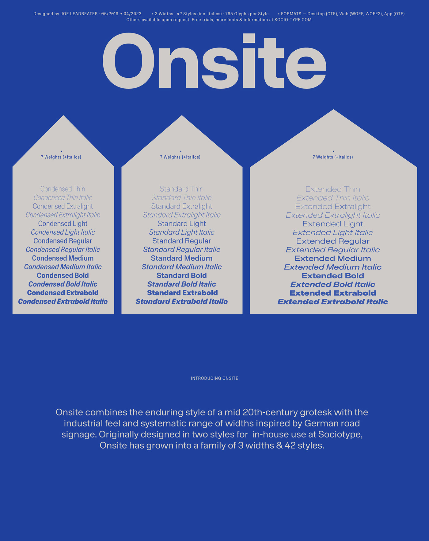
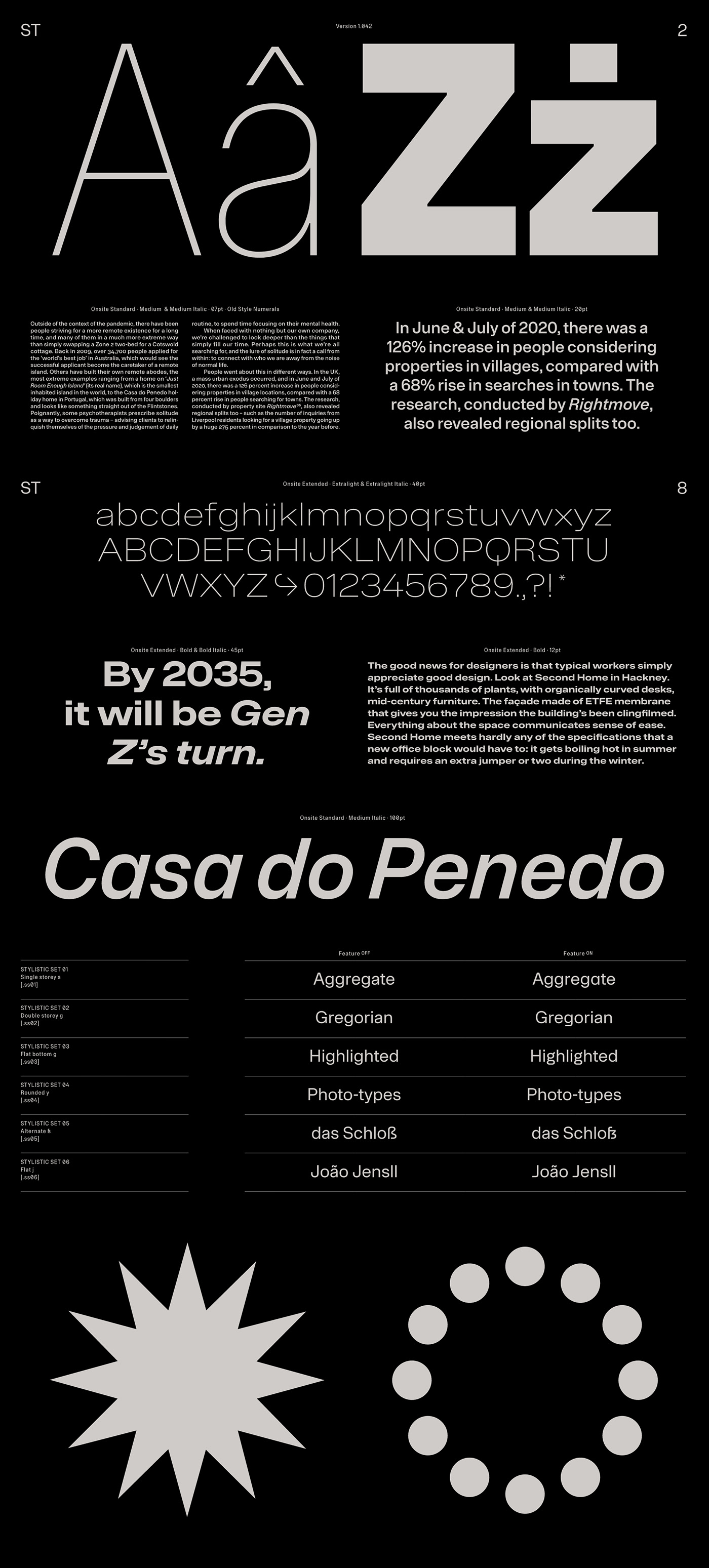
AN UNCOMMON GROTESK
Although loosely based on the evergreen model established by Max Meidinger’s Neue Haas Grotesk, Onsite is no revival. Its subtly squared letterforms and trios of widths recall the industrial feel and systematic structure of another 20th century icon, DIN 1451. There’s even a playful hint of the retro futurist attitude of Aldo Novarese’s Eurostile in the flat-bottomed alternates.
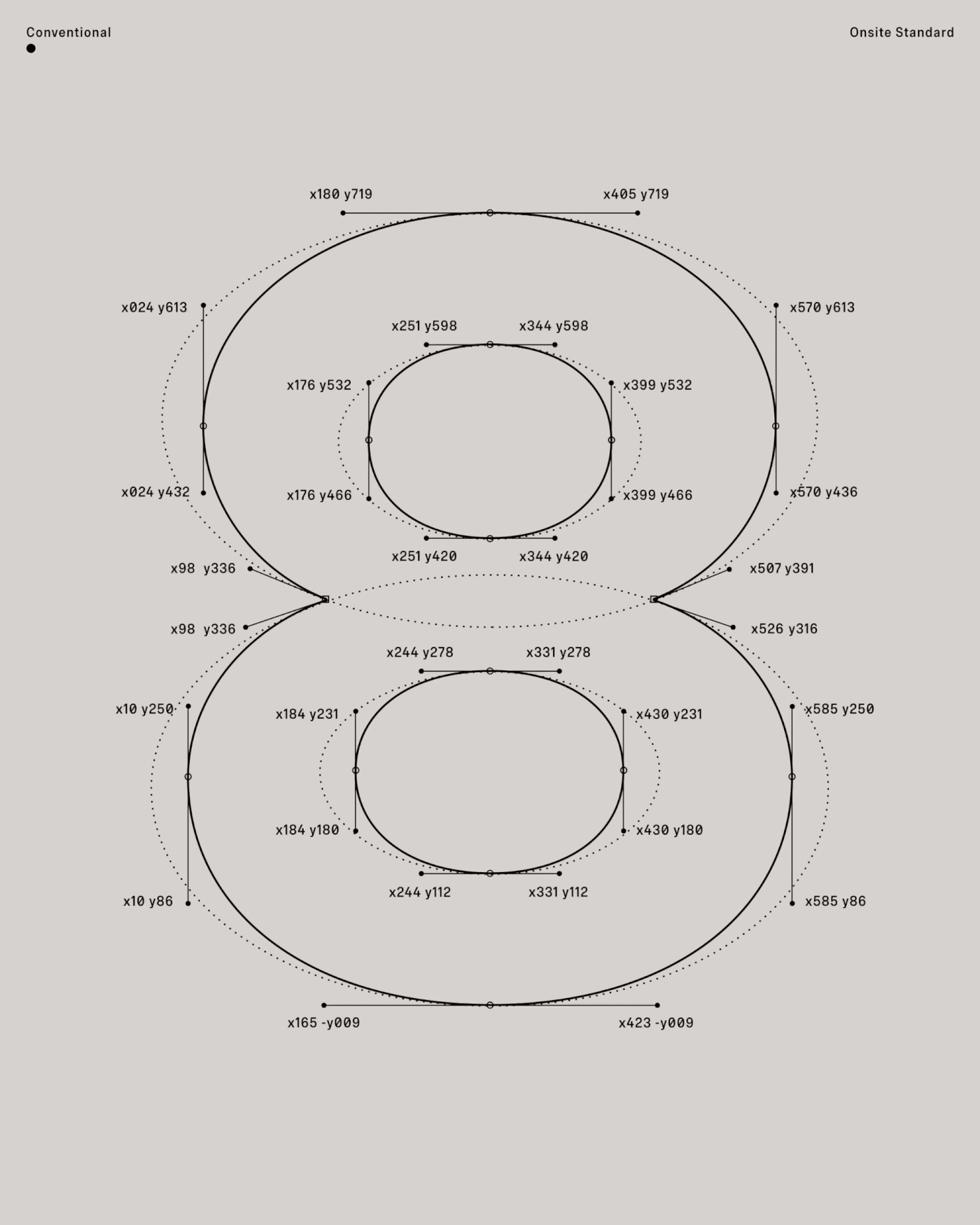
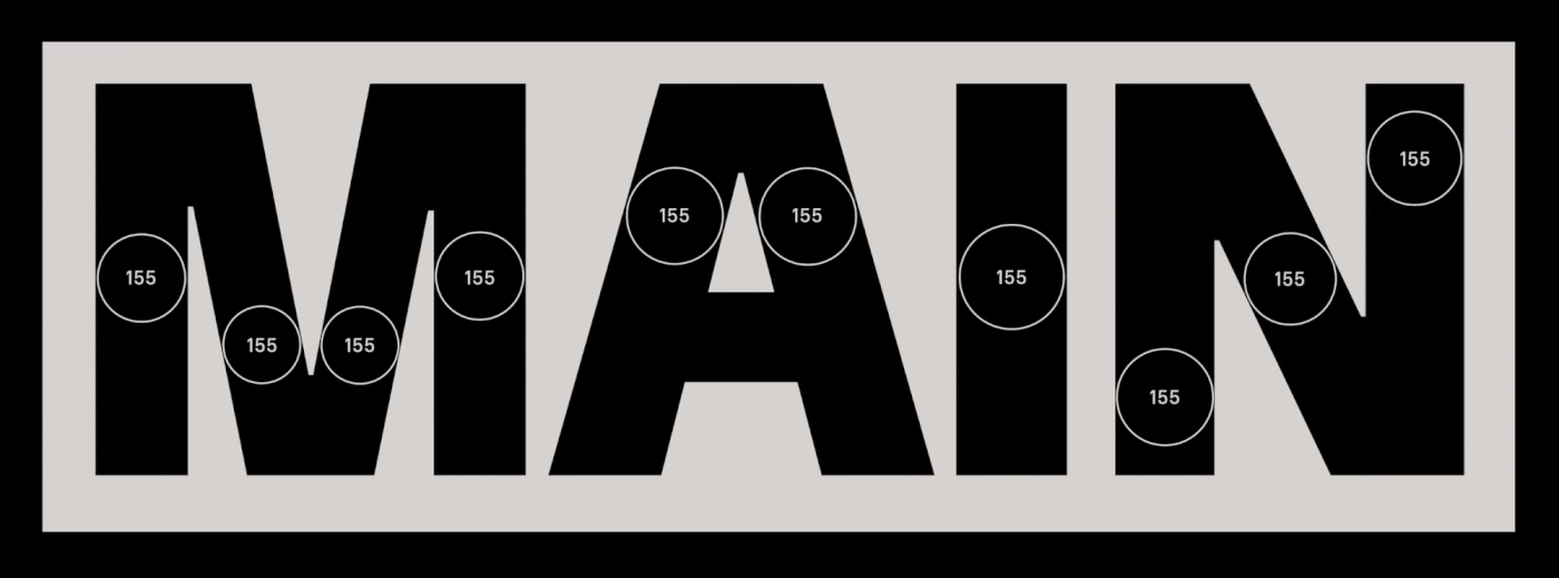
Ultimately though, Onsite’s possesses a personality all of its own. Its stable, robust form offers faultless legibility for small text, while its most distinctive detailing – subtly flattened curves and apexes, double-point structure and almost imperceptibly flared terminals – emerges at display sizes.
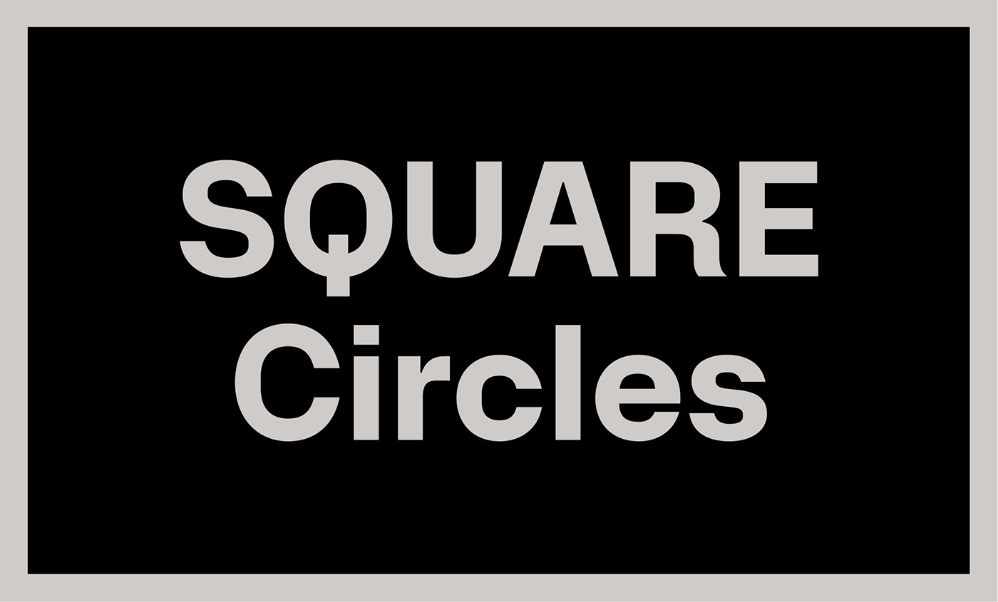
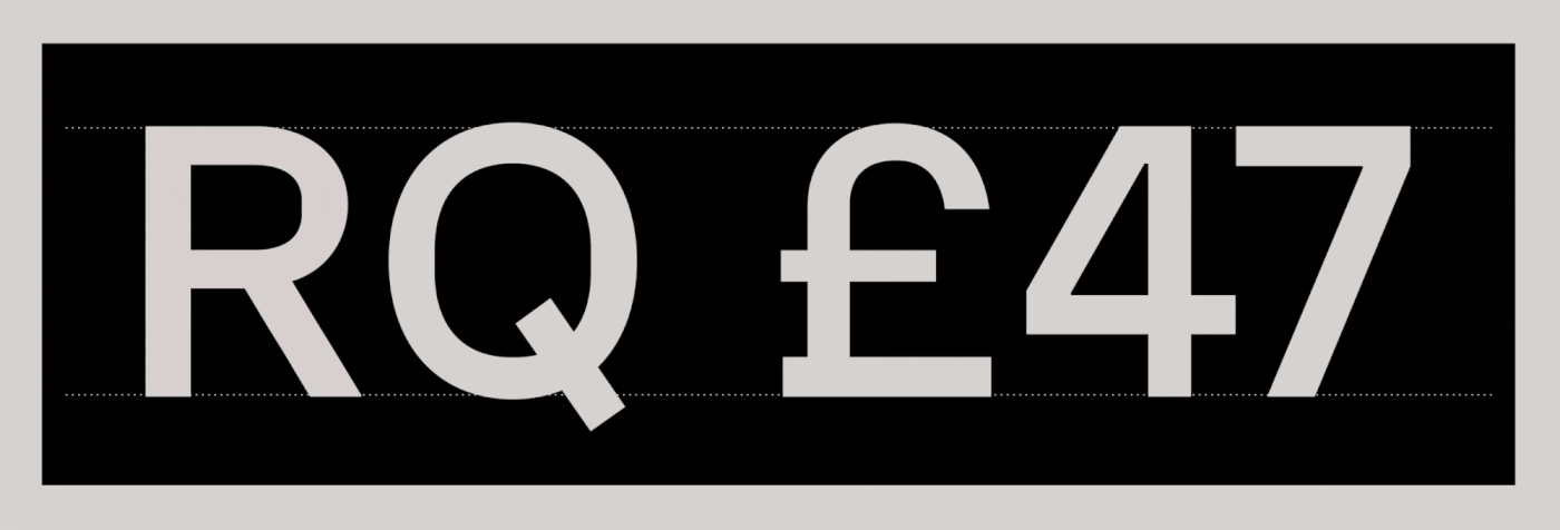
A CHARACTER STUDY
Take a closer look at several of Onsite’s individual characters, and it peels further away from its mid-century origins. An unusually warm personality emerges from its various idiosyncrasies: the jauntily bootcut leg of the uppercase R; the lollipop-like uppercase Q; the deliberate curves of the pound sterling symbol projecting a greater sense of personality (and fun?) than one could reasonably expect from a currency symbol.

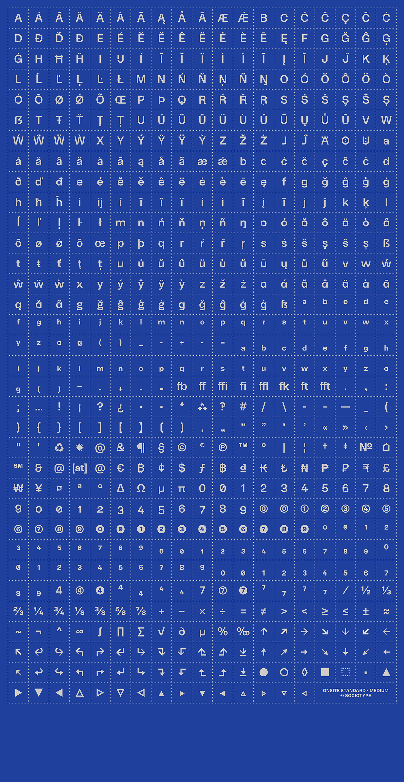
SET FOR ANYTHING
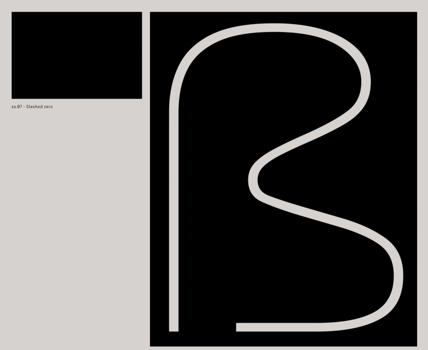
Onsite boasts 16 stylistic sets, including several alternates that push the squarish form to a retro-futuristic extreme, including flat-bottomed g, y and J, and a squared ampersand and @ symbol. For more common use, there’s also a single-story a, double-story g and alternate numerals.

© 2022 Sociotype. All Rights Reserved.